MetaViz (Concept Validation Tool)
An information visualization tool to explore the ideal information visualization
In the class HCDE 411: Information Visualization, I had the pleasure of working with three other Human Centered Design and Engineering students to create an interactive visualization.
Our goal was to create a tool that will generate the “best visualization of information,” regardless of the cultural context. During the project we sought to create a system to inform visualization designers, experts, and professionals about the universality (or lack thereof) the various principles that they are accustomed to.
Depending on who uses this tool and the required context for which the visualizations are used, certain principles may apply more strongly or weakly than others. In order to account for this, we seek to collect input (decisions based on visualizations) from any type of person and present visual results based on this input to a researcher for analysis.
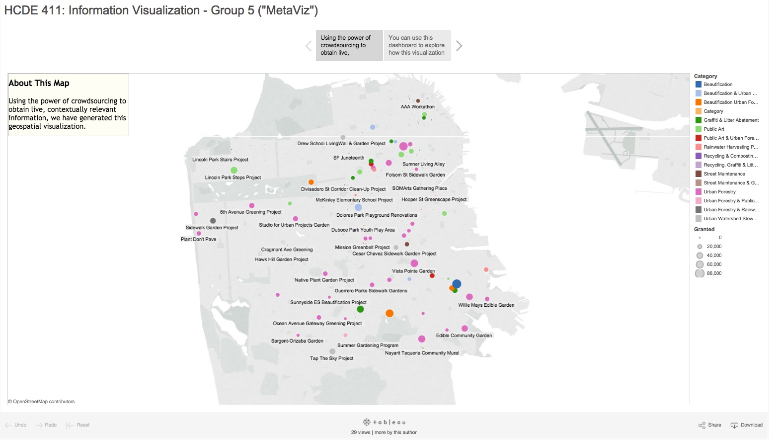
Our final project can be found here along with its corresponding paper.
View the final visualization here: https://public.tableau.com/views/CrowdsourcedMappingofVisualizationPrinciplesHCDE411-Story/Story1?:embed=y&:showTabs=y&:display_count=yes
For a detailed explanation our process and outcomes, please read the final paper entitled, “Mechanical Turk and Information Visualization: Using Mechanical Turk for Validating Information Visualization Principles” (link below):
http://1drv.ms/1P8KyIz
Proposal Presentation
“Effectiveness is not about the medium but, rather, is about the message and the manner in which the message is presented” (Hughes, 2004). In this class, we have explored the concepts of visualization and how their presentation affects the knowledge gained by the viewer. We accept the objective quality of many of the principles currently adopted in information visualization, but we seek to clarify when they apply and when they do not, particularly when the rules are applied to contexts not explicitly explored by the likes of Playfield and Tufte.
The above statement originates from our team’s project proposal which was generated over a two week period as we explored problems many visualization creators face. The entire proposal is available below:
After submitting our proposal, the team followed a User Centered Design process to identify key stakeholders and their current problems with information visualization. A detailed explanation of this process is available in the slide deck below (be sure to click the “notes” button to follow along with the presentation):
Final Presentation
After ideation, data collection and a series of iterative designs (see the section, “Design Process” in the paper), we were able to present a final concept of our visualization:
Final Visualization and Paper
After considering class and additional stakeholder feedback, we generated the final design in the form of a Tableau Story (click the link below to view the live version):
This deliverable, along with the final paper may provide a basis for additional exploration of this problem space. We hope that, in the future, we can continue to contribute to the field of information visualization – using crowdsourcing to verify the ever-changing principles of visualization design and presentation.
View our final paper below: